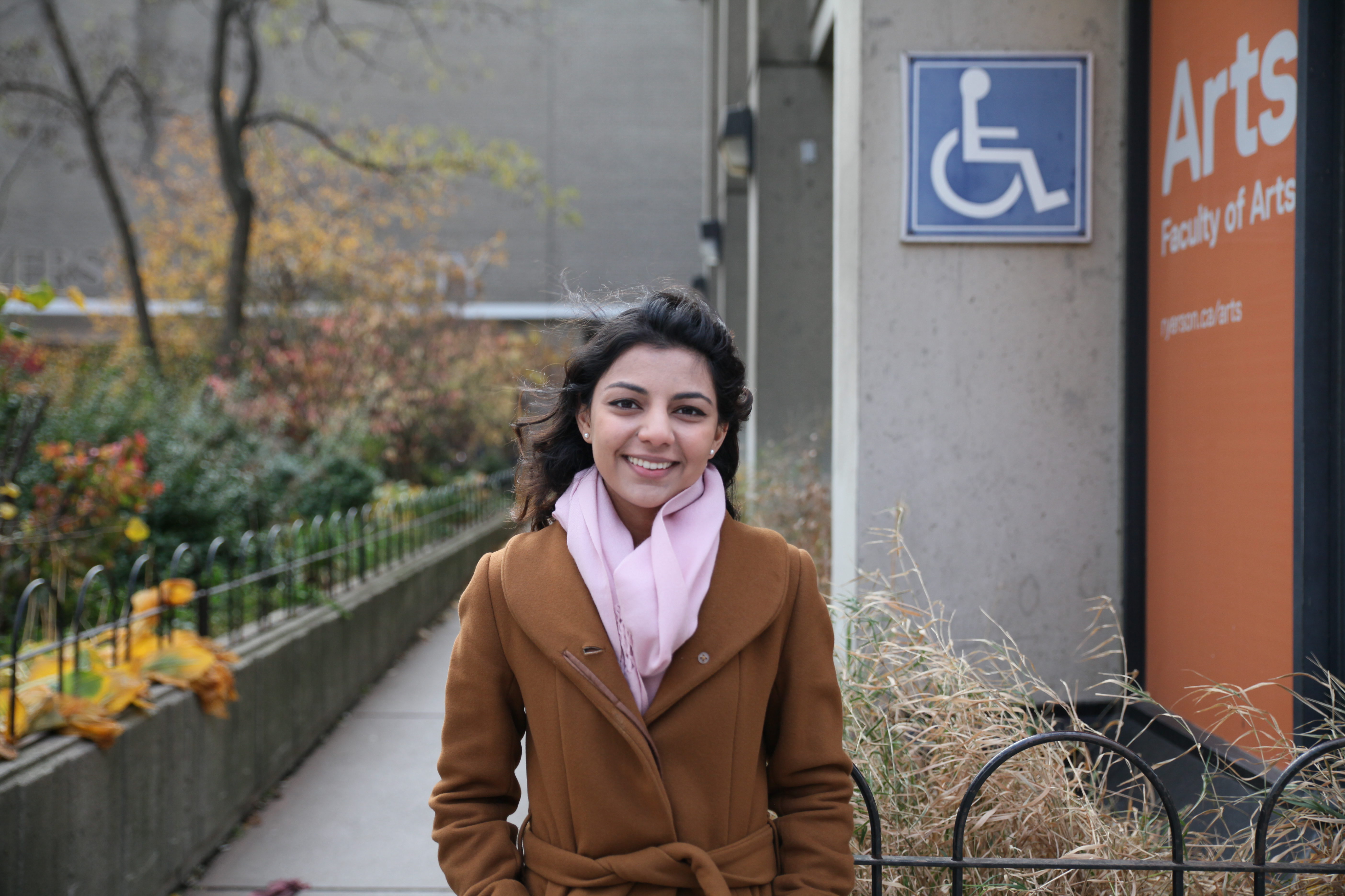
When it comes to building new spaces on campus, accessibility always seems to be an afterthought.
Ryerson has been taking steps to make the campus more accessible for people with disabilities, but exactly how accessible is our campus for those with mobility impairments? I requested an access tour to find out for myself.
I met Heather Willis, the accessibility co-ordinator at Ryerson who leads the tours, at the front entrance of the SLC. Willis is in a wheelchair, so in a way, she also exposed me to the physical relationship she has with the campus.
As someone who doesn’t identify with a disability, my intention in taking the tour was to gain an awareness of how accessible Ryerson is for students and staff with mobility impairments. The answer, I realized after the 90-minute tour, is complicated.
The main purpose of the tour is to provide information about barrier-free routes of access. The most common route shows you how to get from the SLC to the Sally Horsfall Eaton Centre while staying indoors as much as possible. This route, Willis pointed out as we began, took her a couple of years to figure out.
Starting the tour
We started by taking the outdoor elevator on the side of the SLC building up to the main entrance. At first thought, I wondered why we didn’t just take the ramp up to the building. But when you look at the number of students sitting outside with their feet on the ramp, it became clear that the elevator is just easier. Not to mention that the ramp is quite long and tirelessly winds back and forth.
The first thing Willis highlighted were the accessible washrooms. In the SLC there are two types: the gendered cubicles, and the single accessible washrooms for those who need more space.
“The age of a building reflects the level of accessibility.”
As we crossed into the library building, she mentioned that there are also accessible washrooms in this building, but she likes to point out to students that there are better ones elsewhere.
It was at this point that I started to realize how exclusive building designs can be for those with mobility impairments.
How often do I need to think about which washroom would be more accommodating? It’s something that people who don’t use a mobility device often take for granted.
We then moved along the long ramp connecting to Kerr Hall — undoubtedly the most confusing building for those who need to navigate it without using the stairs. As we turned the corner, Willis said something that has really stuck with me. “The age of a building reflects the level of accessibility.”
Kerr Hall was built in the 1960s — back then, accessibility wasn’t a priority. In fact, it wasn’t even a necessity.
Willis and I spoke about how the assumption back then was that people with disabilities weren’t capable of going to school, and therefore didn’t need to be accommodated.
Thankfully, the attitudes around people with disabilities have since changed, but the priority for accessibility still lags behind.
A time lapse of a barrier-free route on campus.
Making buildings more accessible
In 2005, the Ontario government committed to developing five accessibility standards under the Accessibility for Ontarians with Disabilities Act (AODA).
These standards became amendments to Ontario’s Building Code, and new buildings and major renovations must adhere to them.
But on Ryerson’s campus, that’s not what I see. Accessibility is viewed as an add-on feature. For example:
- The SLC was built in 2015, and has since added a number of accessibility features based on feedback from students and staff. The building faced criticism after David Lepofsky, AODA Alliance chair and disability advocate, noted that the large “hangout steps” can’t be used by people in wheelchairs.
- The only fully accessible washroom in the RCC has a ceiling lift, adult change table and a L-shaped bar instead of the standard angled bar. But the ceiling lift was built for a particular student’s need.
- The new ServiceHub, which opened in August 2015, was built with the information counter too high for people in wheelchairs. A section had to be lowered afterwards.
- The soup counter at the new Hub Cafe had to be lowered because it was difficult for wheelchair users to pour their own soup.
The list could go on, and this is exactly the problem.
Accessibility needs within these buildings are reactive responses; they are changes made after the fact. These changes need to be proactive approaches from the beginning.
We ended the tour in Jorgenson Hall, and I felt like we had crossed all kinds of terrain.
There’s the new smooth pavement on Gerrard Street, but also the narrow pathway entering the library lower grounds. Barrier-free routes are the goal, but it’s a slow process to strip away the poor design of prior decades.
Willis manoeuvres through it all with ease. But that’s a testament to her being adaptive when building design hasn’t always been.
And, like she told me at the beginning of the tour, it took her years to figure it out.

